
Category: pro
Python hosting: Host, run, and code Python in the cloud!
Matplotlib Bar chart
Matplotlib may be used to create bar charts. You might like the Matplotlib gallery.
Related course
The course below is all about data visualization:
Bar chart code
The code below creates a bar chart:
import matplotlib.pyplot as plt; plt.rcdefaults() import numpy as np import matplotlib.pyplot as plt objects = ('Python', 'C++', 'Java', 'Perl', 'Scala', 'Lisp') y_pos = np.arange(len(objects)) performance = [10,8,6,4,2,1] plt.bar(y_pos, performance, align='center', alpha=0.5) plt.xticks(y_pos, objects) plt.ylabel('Usage') plt.title('Programming language usage') plt.show() |
Output:

Matplotlib charts can be horizontal, to create a horizontal bar chart:
import matplotlib.pyplot as plt; plt.rcdefaults() import numpy as np import matplotlib.pyplot as plt objects = ('Python', 'C++', 'Java', 'Perl', 'Scala', 'Lisp') y_pos = np.arange(len(objects)) performance = [10,8,6,4,2,1] plt.barh(y_pos, performance, align='center', alpha=0.5) plt.yticks(y_pos, objects) plt.xlabel('Usage') plt.title('Programming language usage') plt.show() |
Output:

More on bar charts
You can compare two data series using this Matplotlib code:
import numpy as np import matplotlib.pyplot as plt # data to plot n_groups = 4 means_frank = (90, 55, 40, 65) means_guido = (85, 62, 54, 20) # create plot fig, ax = plt.subplots() index = np.arange(n_groups) bar_width = 0.35 opacity = 0.8 rects1 = plt.bar(index, means_frank, bar_width, alpha=opacity, color='b', label='Frank') rects2 = plt.bar(index + bar_width, means_guido, bar_width, alpha=opacity, color='g', label='Guido') plt.xlabel('Person') plt.ylabel('Scores') plt.title('Scores by person') plt.xticks(index + bar_width, ('A', 'B', 'C', 'D')) plt.legend() plt.tight_layout() plt.show() |
Output:

Download All Matplotlib Examples
Matplotlib Pie chart
Matplotlib supports pie charts using the pie() function. You might like the Matplotlib gallery.
Related course:
Matplotlib pie chart
The code below creates a pie chart:
import matplotlib.pyplot as plt # Data to plot labels = 'Python', 'C++', 'Ruby', 'Java' sizes = [215, 130, 245, 210] colors = ['gold', 'yellowgreen', 'lightcoral', 'lightskyblue'] explode = (0.1, 0, 0, 0) # explode 1st slice # Plot plt.pie(sizes, explode=explode, labels=labels, colors=colors, autopct='%1.1f%%', shadow=True, startangle=140) plt.axis('equal') plt.show() |
Output:

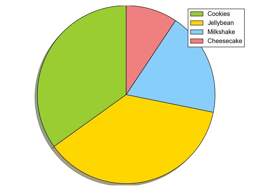
To add a legend use the plt.legend() function:
import matplotlib.pyplot as plt labels = ['Cookies', 'Jellybean', 'Milkshake', 'Cheesecake'] sizes = [38.4, 40.6, 20.7, 10.3] colors = ['yellowgreen', 'gold', 'lightskyblue', 'lightcoral'] patches, texts = plt.pie(sizes, colors=colors, shadow=True, startangle=90) plt.legend(patches, labels, loc="best") plt.axis('equal') plt.tight_layout() plt.show() |
Output:
Download All Matplotlib Examples
Netflix like Thumbnails with Python
Inspired by Netflix, we decided to implement a focal point algorithm. If you use the generated thumbnails on mobile websites, it may increase your click-through-rate (CTR) for YouTube videos.
Eiterway, it’s a fun experiment.
Focal Point
All images have a region of interest, usually a person or face.
This algorithm that finds the region of interest is called a focal point algorithm. Given an input image, a new image (thumbnail) will be created based on the region of interest.

Start with an snapshot image that you want to use as a thumbnail. We use Haar features to find the most interesting region in an image. The haar cascade files can be found here:
- https://raw.githubusercontent.com/Itseez/opencv/master/data/lbpcascades/lbpcascade_frontalface.xml
- https://github.com/adamhrv/HaarcascadeVisualizer
Download these files in a /data/ directory.
#! /usr/bin/python import cv2 bodyCascade = cv2.CascadeClassifier('data/haarcascade_mcs_upperbody.xml') frame = cv2.imread('snapshot.png') frameHeight, frameWidth, frameChannels = frame.shape regions = bodyCascade.detectMultiScale(frame, 1.8, 2) x,y,w,h = regions[0] cv2.imwrite('thumbnail.png', frame[0:frameHeight,x:x+w]) cv2.rectangle(frame,(x,0),(x+w,frameHeight),(0,255,255),6) cv2.imshow("Result",frame) cv2.waitKey(0); |
We load the haar cascade file using cv2.CascadeClassifier() and we load the image using cv2.imread()
Then bodyCascade.detectMultiScale() detects regions of interest using the loaded haar features.
The image is saved as thumbnail using cv2.imwrite() and finally we show the image and highlight the region of interest with a rectangle. After running you will have a nice thumbnail for mobile webpages or apps.
If you also want to detect both body and face you can use:
#! /usr/bin/python import cv2 bodyCascade = cv2.CascadeClassifier('data/haarcascade_mcs_upperbody.xml') faceCascade = cv2.CascadeClassifier('data/lbpcascade_frontalface.xml') frame = cv2.imread('snapshot2.png') frameHeight, frameWidth, frameChannels = frame.shape regions = bodyCascade.detectMultiScale(frame, 1.5, 2) x,y,w,h = regions[0] cv2.imwrite('thumbnail.png', frame[0:frameHeight,x:x+w]) cv2.rectangle(frame,(x,0),(x+w,frameHeight),(0,255,255),6) faceregions = faceCascade.detectMultiScale(frame, 1.5, 2) x,y,w,h = faceregions[0] cv2.rectangle(frame,(x,y),(x+w,y+h),(0,255,0),6) cv2.imshow("Result",frame) cv2.waitKey(0); cv2.imwrite('out.png', frame) |
Matplotlib legend
Matplotlib has native support for legends. Legends can be placed in various positions: A legend can be placed inside or outside the chart and the position can be moved.
The legend() method adds the legend to the plot. In this article we will show you some examples of legends using matplotlib.
Related course
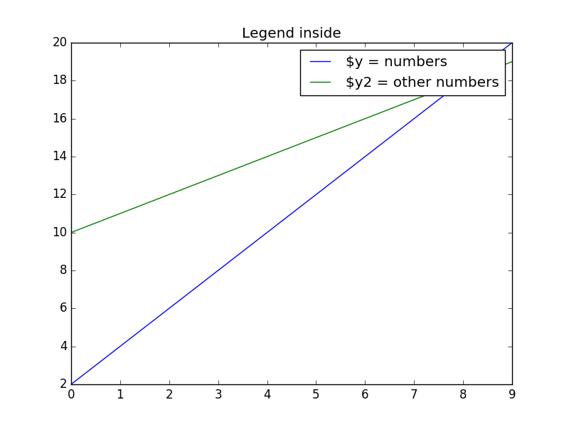
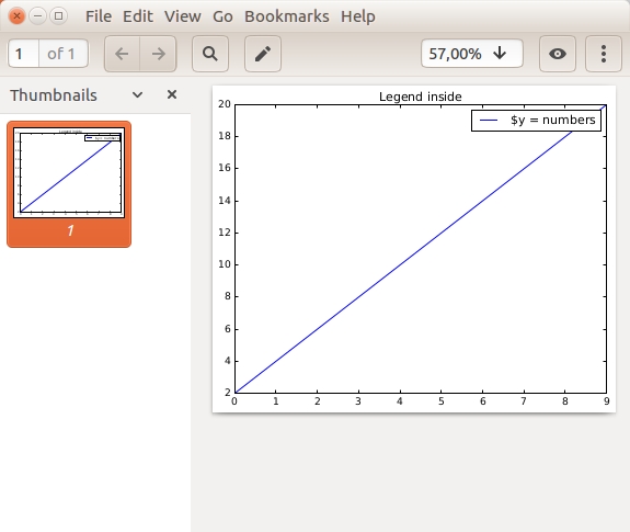
Matplotlib legend inside
To place the legend inside, simply call legend():
import matplotlib.pyplot as plt import numpy as np y = [2,4,6,8,10,12,14,16,18,20] y2 = [10,11,12,13,14,15,16,17,18,19] x = np.arange(10) fig = plt.figure() ax = plt.subplot(111) ax.plot(x, y, label='$y = numbers') ax.plot(x, y2, label='$y2 = other numbers') plt.title('Legend inside') ax.legend() plt.show() |
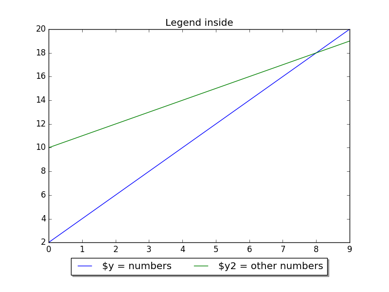
Matplotlib legend on bottom
To place the legend on the bottom, change the legend() call to:
ax.legend(loc='upper center', bbox_to_anchor=(0.5, -0.05), shadow=True, ncol=2) |
Take into account that we set the number of columns two ncol=2 and set a shadow.
The complete code would be:
import matplotlib.pyplot as plt import numpy as np y = [2,4,6,8,10,12,14,16,18,20] y2 = [10,11,12,13,14,15,16,17,18,19] x = np.arange(10) fig = plt.figure() ax = plt.subplot(111) ax.plot(x, y, label='$y = numbers') ax.plot(x, y2, label='$y2 = other numbers') plt.title('Legend inside') ax.legend(loc='upper center', bbox_to_anchor=(0.5, -0.05), shadow=True, ncol=2) plt.show() |
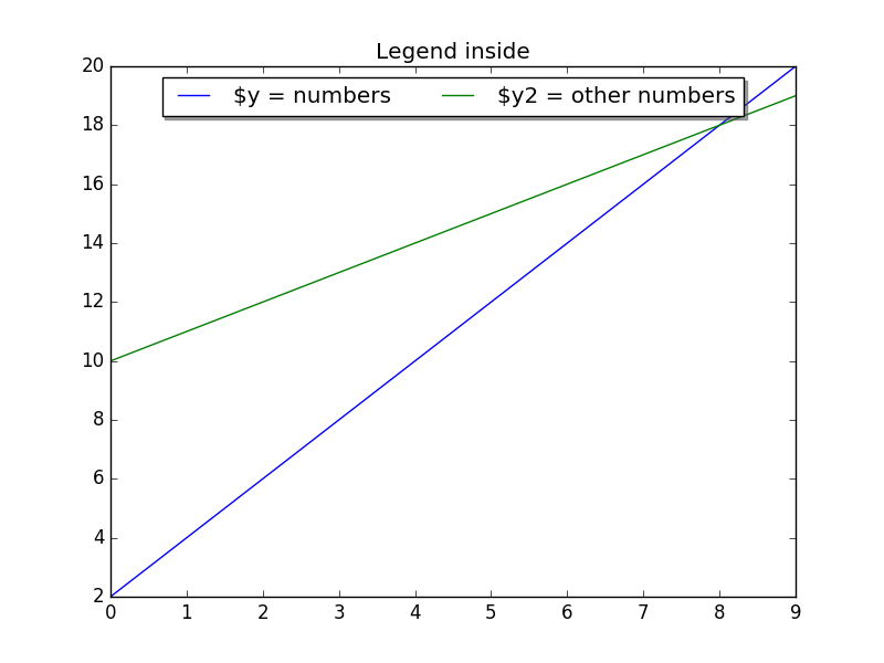
Matplotlib legend on top
To put the legend on top, change the bbox_to_anchor values:
ax.legend(loc='upper center', bbox_to_anchor=(0.5, 1.00), shadow=True, ncol=2) |
Code:
import matplotlib.pyplot as plt import numpy as np y = [2,4,6,8,10,12,14,16,18,20] y2 = [10,11,12,13,14,15,16,17,18,19] x = np.arange(10) fig = plt.figure() ax = plt.subplot(111) ax.plot(x, y, label='$y = numbers') ax.plot(x, y2, label='$y2 = other numbers') plt.title('Legend inside') ax.legend(loc='upper center', bbox_to_anchor=(0.5, 1.00), shadow=True, ncol=2) plt.show() |
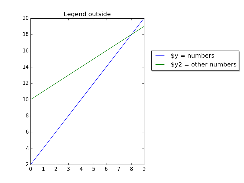
Legend outside right
We can put the legend ouside by resizing the box and puting the legend relative to that:
chartBox = ax.get_position() ax.set_position([chartBox.x0, chartBox.y0, chartBox.width*0.6, chartBox.height]) ax.legend(loc='upper center', bbox_to_anchor=(1.45, 0.8), shadow=True, ncol=1) |
Code:
import matplotlib.pyplot as plt import numpy as np y = [2,4,6,8,10,12,14,16,18,20] y2 = [10,11,12,13,14,15,16,17,18,19] x = np.arange(10) fig = plt.figure() ax = plt.subplot(111) ax.plot(x, y, label='$y = numbers') ax.plot(x, y2, label='$y2 = other numbers') plt.title('Legend outside') chartBox = ax.get_position() ax.set_position([chartBox.x0, chartBox.y0, chartBox.width*0.6, chartBox.height]) ax.legend(loc='upper center', bbox_to_anchor=(1.45, 0.8), shadow=True, ncol=1) plt.show() |
Matplotlib save figure to image file
Related course
The course below is all about data visualization:
Save figure
Matplotlib can save plots directly to a file using savefig().
The method can be used like this:
fig.savefig('plot.png') |
Complete example:
import matplotlib import matplotlib.pyplot as plt import numpy as np y = [2,4,6,8,10,12,14,16,18,20] x = np.arange(10) fig = plt.figure() ax = plt.subplot(111) ax.plot(x, y, label='$y = numbers') plt.title('Legend inside') ax.legend() #plt.show() fig.savefig('plot.png') |
To change the format, simply change the extension like so:
fig.savefig('plot.pdf') |
You can open your file using
display plot.png |
or open it in an image or pdf viewer,
Matplotlib update plot
Updating a matplotlib plot is straightforward. Create the data, the plot and update in a loop.
Setting interactive mode on is essential: plt.ion(). This controls if the figure is redrawn every draw() command. If it is False (the default), then the figure does not update itself.
Related courses:
Update plot example
Copy the code below to test an interactive plot.
import matplotlib.pyplot as plt import numpy as np x = np.linspace(0, 10*np.pi, 100) y = np.sin(x) plt.ion() fig = plt.figure() ax = fig.add_subplot(111) line1, = ax.plot(x, y, 'b-') for phase in np.linspace(0, 10*np.pi, 100): line1.set_ydata(np.sin(0.5 * x + phase)) fig.canvas.draw() |

Explanation
We create the data to plot using:
x = np.linspace(0, 10*np.pi, 100) y = np.sin(x) |
Turn on interacive mode using:
plt.ion() |
Configure the plot (the ‘b-‘ indicates a blue line):
fig = plt.figure() ax = fig.add_subplot(111) line1, = ax.plot(x, y, 'b-') |
And finally update in a loop:
for phase in np.linspace(0, 10*np.pi, 100): line1.set_ydata(np.sin(0.5 * x + phase)) fig.canvas.draw() |