Matplotlib is a python library for visualizing data. You can use it to create bar charts in python. Installation of matplot is on pypi, so just use pip: pip install matplotlib
A bar chart shows values as vertical bars, where the position of each bar indicates the value it represents. matplot aims to make it as easy as possible to turn data into Bar Charts.
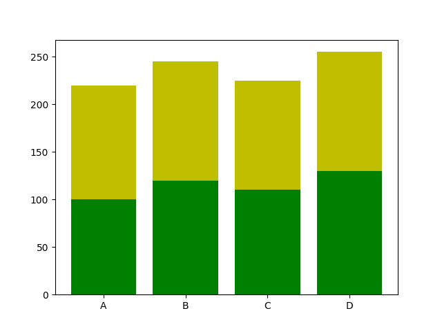
A bar chart in matplotlib made from python code. The code below creates a bar chart:
import matplotlib.pyplot as plt; plt.rcdefaults() import numpy as np import matplotlib.pyplot as plt
Hi, this tutorial was great and I successfully plotted some data with the bar chart comparison. How would I go about adding standard deviations to each bar?


Leave a Reply:
Thank you......You made my day..... :).......
Hi, this tutorial was great and I successfully plotted some data with the bar chart comparison. How would I go about adding standard deviations to each bar?
Best,
Sarah