python logo


Tag: matplot

Matplotlib legend

matplotlib save figure

matplotlib update plot

Updating a matplotlib plot is straightforward. Create the data, the plot and update in a loop.
Setting interactive mode on is essential: plt.ion(). This controls if the figure is redrawn every draw() command. If it is False (the default), then the figure does not update itself.

Related course:

Update plot example

Copy the code below to test an interactive plot.


import matplotlib.pyplot as plt
import numpy as np

x = np.linspace(0, 10*np.pi, 100)
y = np.sin(x)

plt.ion()
fig = plt.figure()
ax = fig.add_subplot(111)
line1, = ax.plot(x, y, 'b-')

for phase in np.linspace(0, 10*np.pi, 100):
line1.set_ydata(np.sin(0.5 * x + phase))
fig.canvas.draw()

matplotlib-update Capture of a frame of the program above

Explanation
We create the data to plot using:


x = np.linspace(0, 10*np.pi, 100)
y = np.sin(x)

Turn on interacive mode using:


plt.ion()

Configure the plot (the ‘b-‘ indicates a blue line):


fig = plt.figure()
ax = fig.add_subplot(111)
line1, = ax.plot(x, y, 'b-')

And finally update in a loop:


for phase in np.linspace(0, 10*np.pi, 100):
line1.set_ydata(np.sin(0.5 * x + phase))
fig.canvas.draw()

Download Examples
 

matplotlib time axis

Matplotlib supports plots with time on the horizontal (x) axis. The data values will be put on the vertical (y) axis. In this article we’ll demonstrate that using a few examples.

It is required to use the Python datetime module, a standard module.

Related course

Plot time
You can plot time using a timestamp:


import matplotlib
import matplotlib.pyplot as plt
import numpy as np
import datetime

# create data
y = [ 2,4,6,8,10,12,14,16,18,20 ]
x = [datetime.datetime.now() + datetime.timedelta(hours=i) for i in range(len(y))]

# plot
plt.plot(x,y)
plt.gcf().autofmt_xdate()
plt.show()

matplotilb-time

If you want to change the interval use one of the lines below:


# minutes
x = [datetime.datetime.now() + datetime.timedelta(minutes=i) for i in range(len(y))]

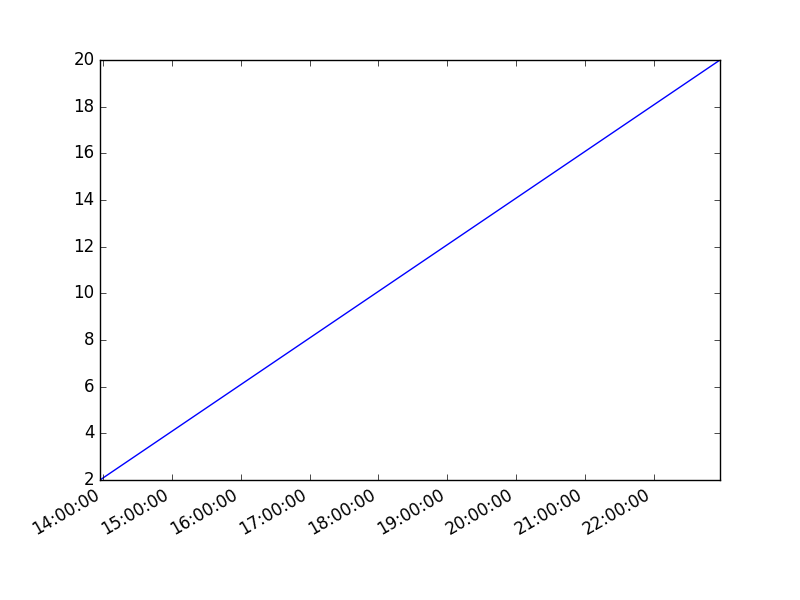
Time plot from specific hour/minute

To start from a specific date, create a new timestamp using datetime.datetime(year, month, day, hour, minute).
Full example:


import matplotlib
import matplotlib.pyplot as plt
import numpy as np
import datetime

# create data
customdate = datetime.datetime(2016, 1, 1, 13, 30)
y = [ 2,4,6,8,10,12,14,16,18,20 ]
x = [customdate + datetime.timedelta(hours=i) for i in range(len(y))]

# plot
plt.plot(x,y)
plt.gcf().autofmt_xdate()
plt.show()

Download Examples

matplotlib heatmap

A heatmap can be created using Matplotlib and numpy.

Related courses
If you want to learn more on data visualization, this course is good:

Heatmap example


The histogram2d function can be used to generate a heatmap.

We create some random data arrays (x,y) to use in the program. We set bins to 64, the resulting heatmap will be 64x64. If you want another size change the number of bins.


import numpy as np
import numpy.random
import matplotlib.pyplot as plt

# Create data
x = np.random.randn(4096)
y = np.random.randn(4096)

# Create heatmap
heatmap, xedges, yedges = np.histogram2d(x, y, bins=(64,64))
extent = [xedges[0], xedges[-1], yedges[0], yedges[-1]]

# Plot heatmap
plt.clf()
plt.title('Pythonspot.com heatmap example')
plt.ylabel('y')
plt.xlabel('x')
plt.imshow(heatmap, extent=extent)
plt.show()

Result:

matplot-heatmap Matplotlib heatmap

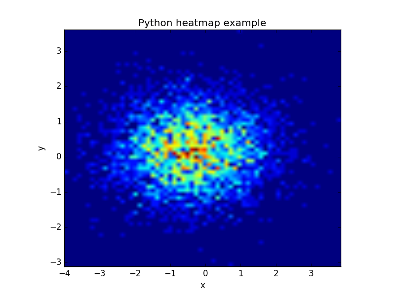
The datapoints in this example are totally random and generated using np.random.randn()


subplot python

python plot matrix