
Visualize data with Pandas
Get the xls data for this tutorial from: depaul.edu. This dataset contains a list of US presidents, associated parties,profession and more.
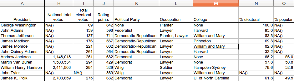 Python Pandas Dataset
Beautiful Plots with Pandas We can plot data of this large excel file with a few lines of code. We select the column "Occupation" for this demonstration using:
df['Occupation'].Full code:
from pandas import DataFrame, read_csv
import matplotlib.pyplot as plt
import pandas as pd
file = r'data/Presidents.xls'
df = pd.read_excel(file)
# plot data
colors = ['yellowgreen', 'gold', 'lightskyblue', 'lightcoral','red','green','blue','orange','white','brown']
df['Occupation'].value_counts().plot(kind='pie',title='Occupation by President',colors=colors)
plt.show()

Data cleaning and plotting We can also plot the popularity by president. Before we do that, we need to clean some data:
 Data cleaning with Pandas
Some of the cells do not contain numerical values, we can either remove them or replace them:
#df = df.replace('NA()',0)
df = df[df['% popular'] != 'NA()']
To plot the popularity:
from pandas import DataFrame, read_csv
import matplotlib.pyplot as plt
import pandas as pd
file = r'data/Presidents.xls'
df = pd.read_excel(file)
# plot data
#df = df.replace('NA()',0)
df = df[df['% popular'] != 'NA()']
print( df['% popular'] )
df['% popular'].plot(kind='hist', bins=8, title='Popularity by President', facecolor='blue', alpha=0.5, normed=1)
plt.show()
 Popularity by President