Category: pro
Python hosting: Host, run, and code Python in the cloud!
Matplotlib update plot
Updating a matplotlib plot is straightforward. Create the data, the plot and update in a loop.
Setting interactive mode on is essential: plt.ion(). This controls if the figure is redrawn every draw() command. If it is False (the default), then the figure does not update itself.
Related course:
Data Visualization with Matplotlib and Python
Update plot example
Copy the code below to test an interactive plot.
import matplotlib.pyplot as plt import numpy as np x = np.linspace(0, 10*np.pi, 100) y = np.sin(x) plt.ion() fig = plt.figure() ax = fig.add_subplot(111) line1, = ax.plot(x, y, 'b-') for phase in np.linspace(0, 10*np.pi, 100): line1.set_ydata(np.sin(0.5 * x + phase)) fig.canvas.draw() |

Explanation
We create the data to plot using:
x = np.linspace(0, 10*np.pi, 100) y = np.sin(x) |
Turn on interacive mode using:
plt.ion() |
Configure the plot (the ‘b-‘ indicates a blue line):
fig = plt.figure() ax = fig.add_subplot(111) line1, = ax.plot(x, y, 'b-') |
And finally update in a loop:
for phase in np.linspace(0, 10*np.pi, 100): line1.set_ydata(np.sin(0.5 * x + phase)) fig.canvas.draw() |
Plot time with matplotlib
Matplotlib supports plots with time on the horizontal (x) axis. The data values will be put on the vertical (y) axis. In this article we’ll demonstrate that using a few examples.
It is required to use the Python datetime module, a standard module.
Related course
Plot time
You can plot time using a timestamp:
import matplotlib import matplotlib.pyplot as plt import numpy as np import datetime # create data y = [ 2,4,6,8,10,12,14,16,18,20 ] x = [datetime.datetime.now() + datetime.timedelta(hours=i) for i in range(len(y))] # plot plt.plot(x,y) plt.gcf().autofmt_xdate() plt.show() |
If you want to change the interval use one of the lines below:
# minutes x = [datetime.datetime.now() + datetime.timedelta(minutes=i) for i in range(len(y))] |
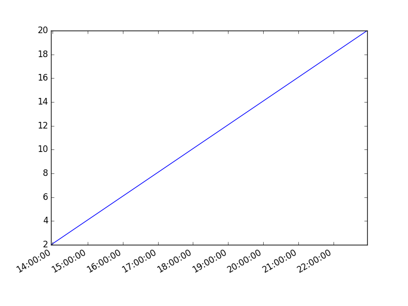
Time plot from specific hour/minute
To start from a specific date, create a new timestamp using datetime.datetime(year, month, day, hour, minute).
Full example:
import matplotlib import matplotlib.pyplot as plt import numpy as np import datetime # create data customdate = datetime.datetime(2016, 1, 1, 13, 30) y = [ 2,4,6,8,10,12,14,16,18,20 ] x = [customdate + datetime.timedelta(hours=i) for i in range(len(y))] # plot plt.plot(x,y) plt.gcf().autofmt_xdate() plt.show() |
Generate heatmap in Matplotlib
A heatmap can be created using Matplotlib and numpy.
Related courses
If you want to learn more on data visualization, these courses are good:
Heatmap example
The histogram2d function can be used to generate a heatmap.
We create some random data arrays (x,y) to use in the program. We set bins to 64, the resulting heatmap will be 64×64. If you want another size change the number of bins.
import numpy as np import numpy.random import matplotlib.pyplot as plt # Create data x = np.random.randn(4096) y = np.random.randn(4096) # Create heatmap heatmap, xedges, yedges = np.histogram2d(x, y, bins=(64,64)) extent = [xedges[0], xedges[-1], yedges[0], yedges[-1]] # Plot heatmap plt.clf() plt.title('Pythonspot.com heatmap example') plt.ylabel('y') plt.xlabel('x') plt.imshow(heatmap, extent=extent) plt.show() |
Result:
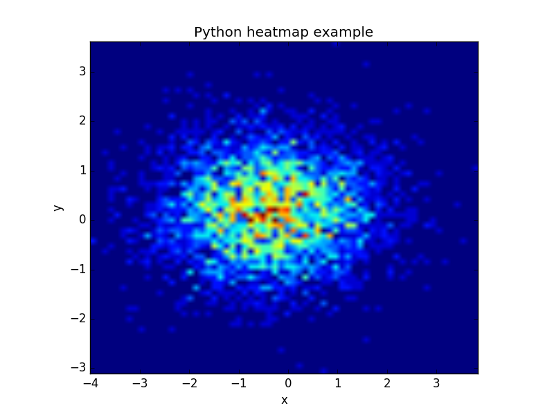
The datapoints in this example are totally random and generated using np.random.randn()
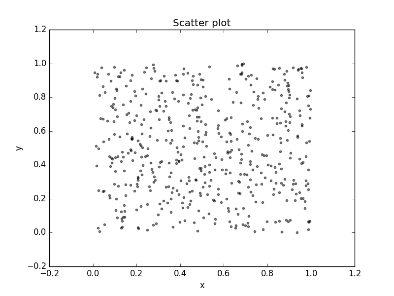
Matplotlib scatterplot
Matplot has a built-in function to create scatterplots called scatter(). A scatter plot is a type of plot that shows the data as a collection of points. The position of a point depends on its two-dimensional value, where each value is a position on either the horizontal or vertical dimension.
Related course
Scatterplot example
Example:
import numpy as np import matplotlib.pyplot as plt # Create data N = 500 x = np.random.rand(N) y = np.random.rand(N) colors = (0,0,0) area = np.pi*3 # Plot plt.scatter(x, y, s=area, c=colors, alpha=0.5) plt.title('Scatter plot pythonspot.com') plt.xlabel('x') plt.ylabel('y') plt.show() |
Scatter plot with groups
Data can be classified in several groups. The code below demonstrates that:
import numpy as np import matplotlib.pyplot as plt # Create data N = 60 g1 = (0.6 + 0.6 * np.random.rand(N), np.random.rand(N)) g2 = (0.4+0.3 * np.random.rand(N), 0.5*np.random.rand(N)) g3 = (0.3*np.random.rand(N),0.3*np.random.rand(N)) data = (g1, g2, g3) colors = ("red", "green", "blue") groups = ("coffee", "tea", "water") # Create plot fig = plt.figure() ax = fig.add_subplot(1, 1, 1, axisbg="1.0") for data, color, group in zip(data, colors, groups): x, y = data ax.scatter(x, y, alpha=0.8, c=color, edgecolors='none', s=30, label=group) plt.title('Matplot scatter plot') plt.legend(loc=2) plt.show() |

3d scatterplot
Matplotlib can create 3d plots. Making a 3D scatterplot is very similar to creating a 2d, only some minor differences. On some occasions, a 3d scatter plot may be a better data visualization than a 2d plot. To create 3d plots, we need to import axes3d.
Related course:
Master Python Data Visualization
Introduction
It is required to import axes3d:
from mpl_toolkits.mplot3d import axes3d |
Give the data a z-axis and set the figure to 3d projection:
ax = fig.gca(projection='3d') |

3d scatterplot
Complete 3d scatterplot example below:
import numpy as np import matplotlib.pyplot as plt from mpl_toolkits.mplot3d import axes3d # Create data N = 60 g1 = (0.6 + 0.6 * np.random.rand(N), np.random.rand(N),0.4+0.1*np.random.rand(N)) g2 = (0.4+0.3 * np.random.rand(N), 0.5*np.random.rand(N),0.1*np.random.rand(N)) g3 = (0.3*np.random.rand(N),0.3*np.random.rand(N),0.3*np.random.rand(N)) data = (g1, g2, g3) colors = ("red", "green", "blue") groups = ("coffee", "tea", "water") # Create plot fig = plt.figure() ax = fig.add_subplot(1, 1, 1, axisbg="1.0") ax = fig.gca(projection='3d') for data, color, group in zip(data, colors, groups): x, y, z = data ax.scatter(x, y, z, alpha=0.8, c=color, edgecolors='none', s=30, label=group) plt.title('Matplot 3d scatter plot') plt.legend(loc=2) plt.show() |
The plot is created using several steps:
- vector creation (g1,g2,g3)
- list creation (groups)
- plotting
The final plot is shown with plt.show()
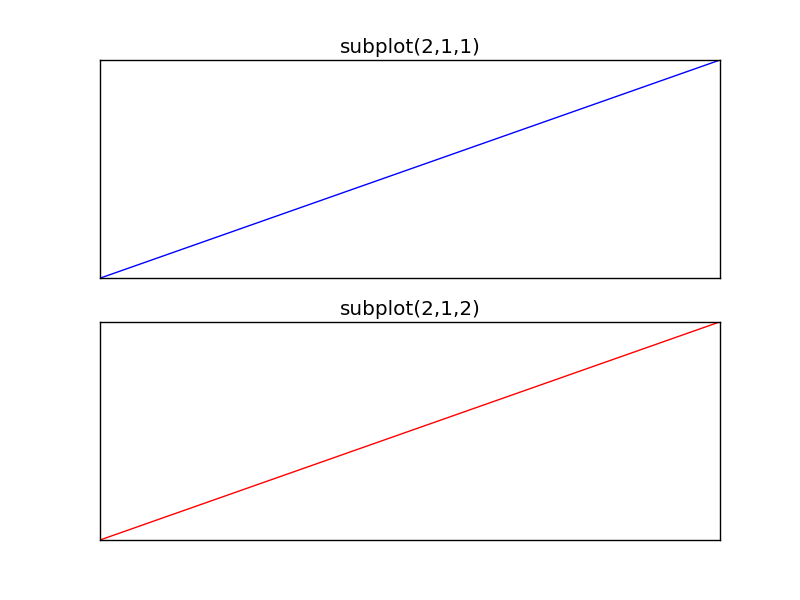
Matplotlib Subplot
The Matplotlib subplot() function can be called to plot two or more plots in one figure. Matplotlib supports all kind of subplots including 2×1 vertical, 2×1 horizontal or a 2×2 grid.
Related courses
Horizontal subplot
Use the code below to create a horizontal subplot
from pylab import * t = arange(0.0, 20.0, 1) s = [1,2,3,4,5,6,7,8,9,10,11,12,13,14,15,16,17,18,19,20] subplot(2,1,1) xticks([]), yticks([]) title('subplot(2,1,1)') plot(t,s) subplot(2,1,2) xticks([]), yticks([]) title('subplot(2,1,2)') plot(t,s,'r-') show() |
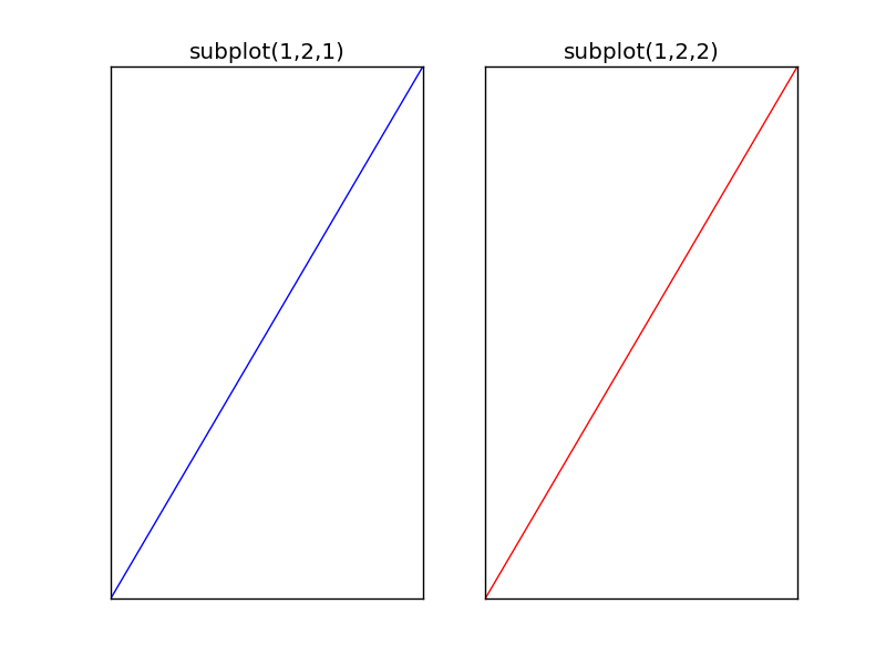
Vertical subplot
By changing the subplot parameters we can create a vertical plot
from pylab import * t = arange(0.0, 20.0, 1) s = [1,2,3,4,5,6,7,8,9,10,11,12,13,14,15,16,17,18,19,20] subplot(1,2,1) xticks([]), yticks([]) title('subplot(1,2,1)') plot(t,s) subplot(1,2,2) xticks([]), yticks([]) title('subplot(1,2,2)') plot(t,s,'r-') show() |
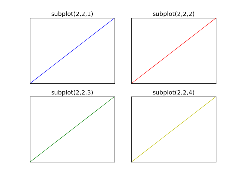
Subplot grid
To create a 2×2 grid of plots, you can use this code:
from pylab import * t = arange(0.0, 20.0, 1) s = [1,2,3,4,5,6,7,8,9,10,11,12,13,14,15,16,17,18,19,20] subplot(2,2,1) xticks([]), yticks([]) title('subplot(2,2,1)') plot(t,s) subplot(2,2,2) xticks([]), yticks([]) title('subplot(2,2,2)') plot(t,s,'r-') subplot(2,2,3) xticks([]), yticks([]) title('subplot(2,2,3)') plot(t,s,'g-') subplot(2,2,4) xticks([]), yticks([]) title('subplot(2,2,4)') plot(t,s,'y-') show() |