Matplotlib Histogram
Matplotlib can be used to create histograms. A histogram shows the frequency on the vertical axis and the horizontal axis is another dimension. Usually it has bins, where every bin has a minimum and maximum value. Each bin also has a frequency between x and infinite.
Related course
Practice Python with interactive exercises
Matplotlib histogram example Below we show the most minimal Matplotlib histogram:
import numpy as np
import matplotlib.mlab as mlab
import matplotlib.pyplot as plt
x = [21,22,23,4,5,6,77,8,9,10,31,32,33,34,35,36,37,18,49,50,100]
num_bins = 5
n, bins, patches = plt.hist(x, num_bins, facecolor='blue', alpha=0.5)
plt.show()
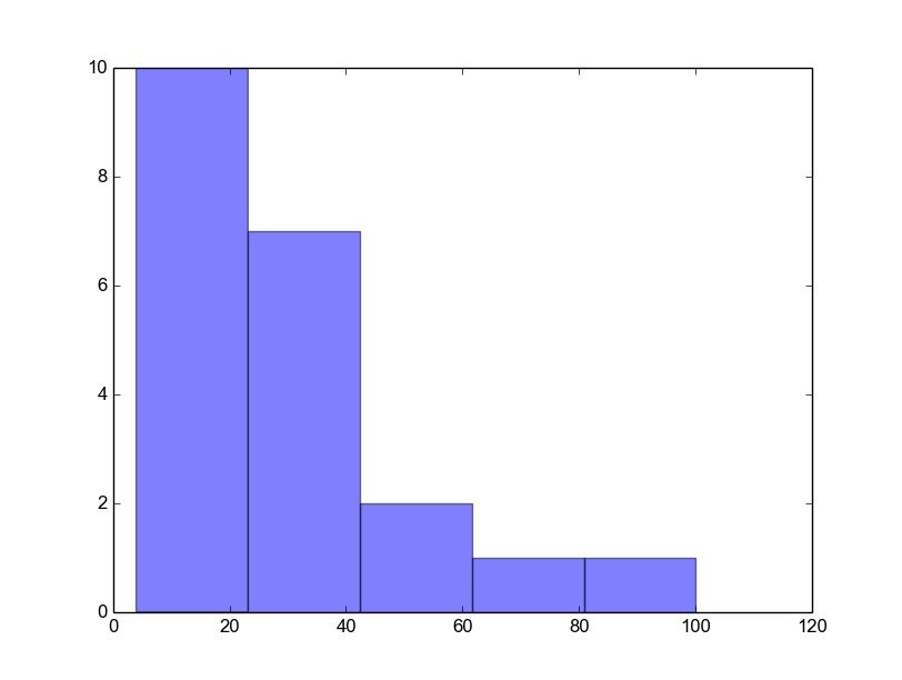 Python histogram
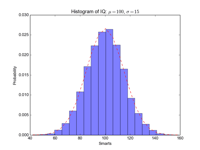
A complete matplotlib python histogram Many things can be added to a histogram such as a fit line, labels and so on. The code below creates a more advanced histogram.
#!/usr/bin/env python
import numpy as np
import matplotlib.mlab as mlab
import matplotlib.pyplot as plt
# example data
mu = 100 # mean of distribution
sigma = 15 # standard deviation of distribution
x = mu + sigma * np.random.randn(10000)
num_bins = 20
# the histogram of the data
n, bins, patches = plt.hist(x, num_bins, normed=1, facecolor='blue', alpha=0.5)
# add a 'best fit' line
y = mlab.normpdf(bins, mu, sigma)
plt.plot(bins, y, 'r--')
plt.xlabel('Smarts')
plt.ylabel('Probability')
plt.title(r'Histogram of IQ: $\mu=100$, $\sigma=15$')
# Tweak spacing to prevent clipping of ylabel
plt.subplots_adjust(left=0.15)
plt.show()
 python_histogram