
Category: plotting
Matplotlib Histogram
Matplotlib can be used to create histograms. A histogram shows the frequency on the vertical axis and the horizontal axis is another dimension. Usually it has bins, where every bin has a minimum and maximum value. Each bin also has a frequency between x and infinite.
Related course
Matplotlib histogram example
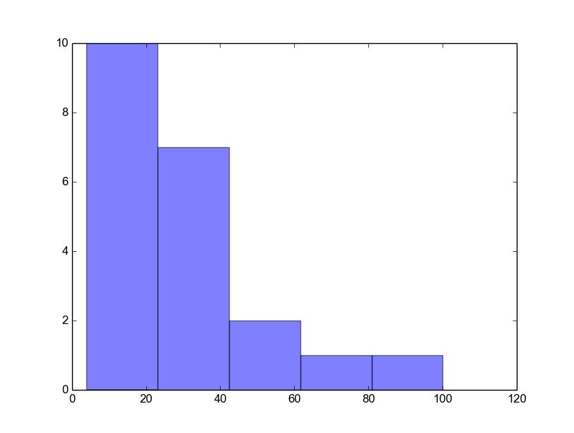
Below we show the most minimal Matplotlib histogram:
import numpy as np |
Output:
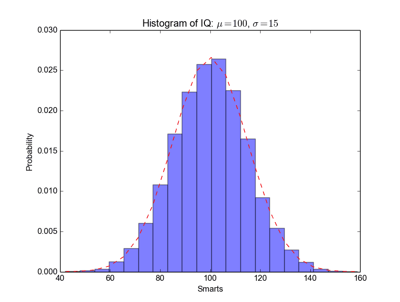
A complete matplotlib python histogram
Many things can be added to a histogram such as a fit line, labels and so on. The code below creates a more advanced histogram.
#!/usr/bin/env python |
Output:
Matplotlib Line chart
Matplotlib Bar chart
Matplotlib may be used to create bar charts. You might like the Matplotlib gallery.
Matplotlib is a python library for visualizing data. You can use it to create bar charts in python. Installation of matplot is on pypi, so just use pip: pip install matplotlib
The course below is all about data visualization:
Related course:
Data Visualization with Matplotlib and Python
Bar chart code
A bar chart shows values as vertical bars, where the position of each bar indicates the value it represents. matplot aims to make it as easy as possible to turn data into Bar Charts.
A bar chart in matplotlib made from python code. The code below creates a bar chart:
import matplotlib.pyplot as plt; plt.rcdefaults() |
Output:

Matplotlib charts can be horizontal, to create a horizontal bar chart:
import matplotlib.pyplot as plt; plt.rcdefaults() |
Output:

Bar chart comparison
You can compare two data series using this Matplotlib code:
import numpy as np |
Output:

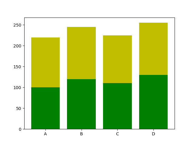
Stacked bar chart
The example below creates a stacked bar chart with Matplotlib. Stacked bar plots show diffrent groups together.
# load matplotlib |
Output:
Download All Matplotlib Examples
pie chart python
Matplotlib is a versatile library in Python that supports the creation of a wide variety of charts, including pie charts. Check out the Matplotlib gallery to explore more chart types.
Related course: Data Visualization with Matplotlib and Python
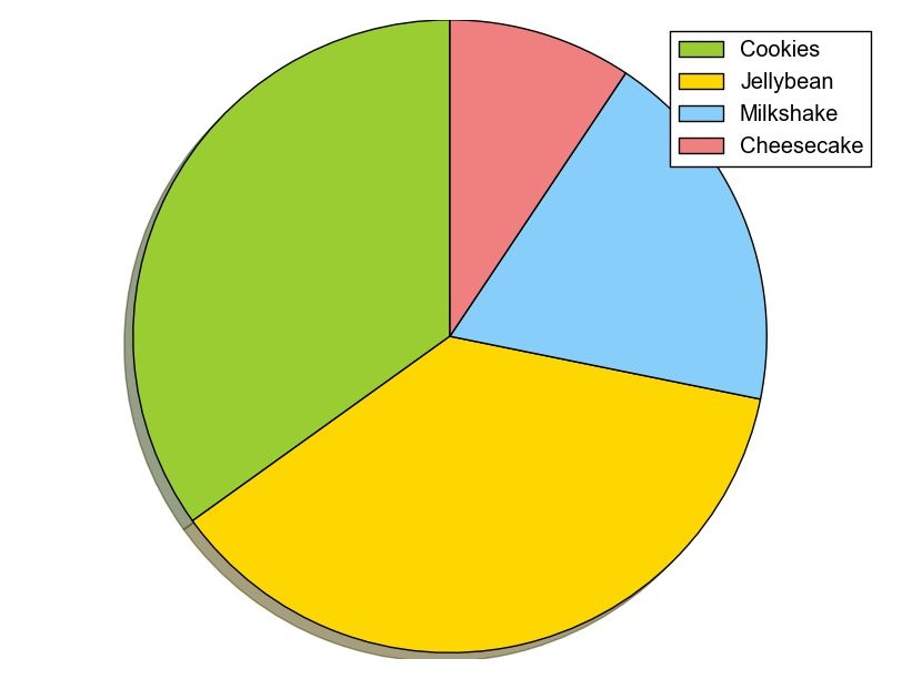
Crafting a Pie Chart with Matplotlib
To begin with, ensure you’ve imported the required module using: import matplotlib.pyplot as plt. Once done, the plt.pie() method is readily available for creating your pie chart.
Here’s a simple example that demonstrates how to generate a pie chart:
import matplotlib.pyplot as plt |
With the above code, the result is a visually pleasing pie chart.

Matplotlib allows for extensive customization. You can determine slice sizes, which segments should stand out from the center (explode), their respective labels, and even their colors.
plt.pie(sizes, explode=explode, labels=labels, colors=colors, ...) |
Enhancing Your Pie Chart with a Legend
To make your pie chart even more informative, consider adding a legend using the plt.legend() function. This overlays a legend on your chart, providing clarity.
import matplotlib.pyplot as plt |
This code renders a pie chart that’s enriched with a legend.
Always remember, after setting up your plot, call the method .show() to ensure it gets displayed.
plt.show() |
For more examples and downloadable code, click here.
Navigation: [
Matplotlib legend
matplotlib save figure
matplotlib update plot
Updating a matplotlib plot is straightforward. Create the data, the plot and update in a loop.
Setting interactive mode on is essential: plt.ion(). This controls if the figure is redrawn every draw() command. If it is False (the default), then the figure does not update itself.
Update plot example
Copy the code below to test an interactive plot.
|

Explanation
We create the data to plot using:
|
Turn on interacive mode using:
|
Configure the plot (the ‘b-‘ indicates a blue line):
|
And finally update in a loop:
|
matplotlib time axis
Matplotlib supports plots with time on the horizontal (x) axis. The data values will be put on the vertical (y) axis. In this article we’ll demonstrate that using a few examples.
It is required to use the Python datetime module, a standard module.
Related course
Plot time
You can plot time using a timestamp:
|
If you want to change the interval use one of the lines below:
|
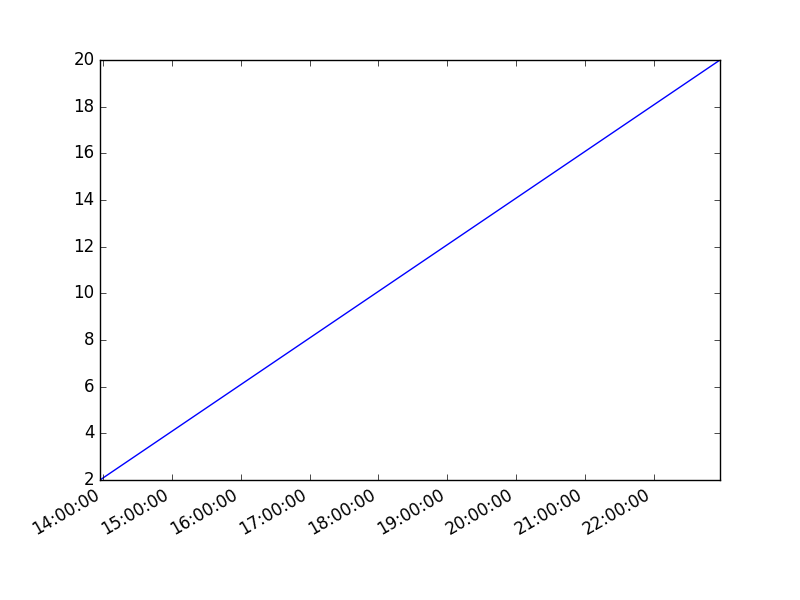
Time plot from specific hour/minute
To start from a specific date, create a new timestamp using datetime.datetime(year, month, day, hour, minute).
Full example:
|
matplotlib heatmap
A heatmap can be created using Matplotlib and numpy.
Related courses
If you want to learn more on data visualization, this course is good:
Heatmap example
The histogram2d function can be used to generate a heatmap.
We create some random data arrays (x,y) to use in the program. We set bins to 64, the resulting heatmap will be 64x64. If you want another size change the number of bins.
|
Result:
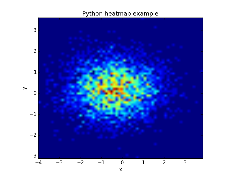
The datapoints in this example are totally random and generated using np.random.randn()
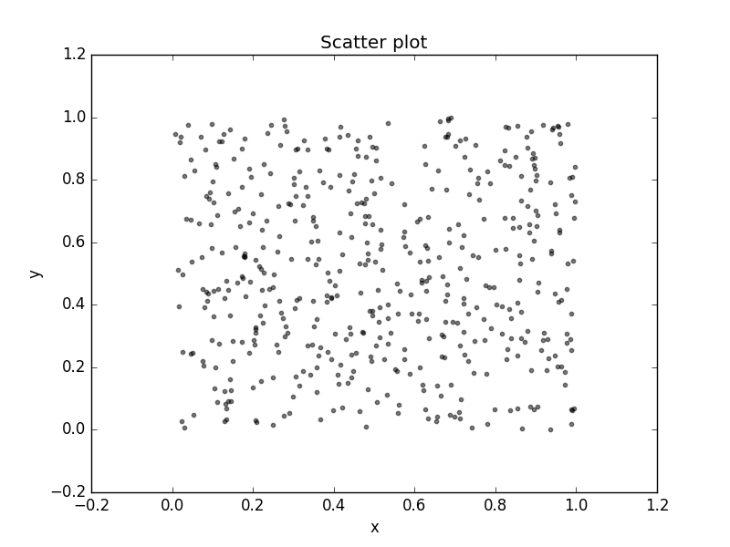
python scatter plot
Matplot has a built-in function to create scatterplots called scatter(). A scatter plot is a type of plot that shows the data as a collection of points. The position of a point depends on its two-dimensional value, where each value is a position on either the horizontal or vertical dimension.
Related course
Scatterplot example
Example:
|
Scatter plot with groups
Data can be classified in several groups. The code below demonstrates that:
|
Related course
