
Matplotlib Line chart
A line chart can be created using the Matplotlib plot() function. While we can just plot a line, we are not limited to that. We can explicitly define the grid, the x and y axis scale and labels, title and display options.
Related course:
Practice Python with interactive exercises
Line chart example The example below will create a line chart.
from pylab import *
t = arange(0.0, 2.0, 0.01)
s = sin(2.5*pi*t)
plot(t, s)
xlabel('time (s)')
ylabel('voltage (mV)')
title('Sine Wave')
grid(True)
show()
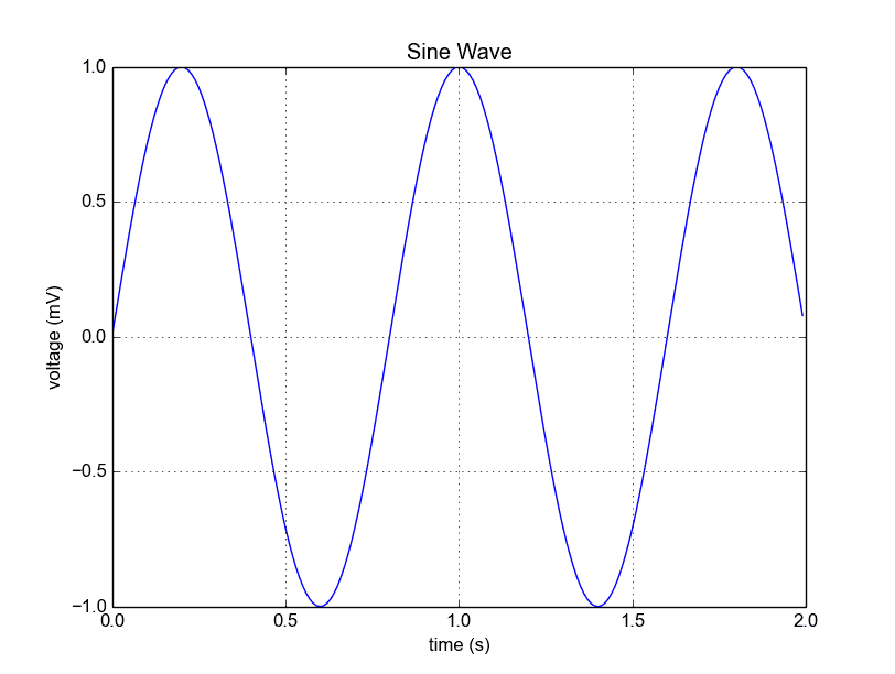 Python Matplotlib Line Chart
The lines:
from pylab import *
t = arange(0.0, 2.0, 0.01)
s = sin(2.5*pi*t)
from pylab import *
t = arange(0.0, 2.0, 0.01)
s = sin(2.5*pi*t)
plot(t, s)
show()
If you want to save the plot to the disk, call the statement:
savefig("line_chart.png")Plot a custom Line Chart
If you want to plot using an array (list), you can execute this script:
from pylab import *
t = arange(0.0, 20.0, 1)
s = [1,2,3,4,5,6,7,8,9,10,11,12,13,14,15,16,17,18,19,20]
plot(t, s)
xlabel('Item (s)')
ylabel('Value')
title('Python Line Chart: Plotting numbers')
grid(True)
show()
t = arange(0.0, 20.0, 1)defines start from 0, plot 20 items (length of our array) with steps of 1.
Output:
 Python Line Chart from List
Multiple plots
If you want to plot multiple lines in one chart, simply call the plot() function multiple times. An example:
from pylab import *
t = arange(0.0, 20.0, 1)
s = [1,2,3,4,5,6,7,8,9,10,11,12,13,14,15,16,17,18,19,20]
s2 = [4,5,6,7,8,9,10,11,12,13,14,15,16,17,18,19,20,21,22,23]
plot(t, s)
plot(t, s2)
xlabel('Item (s)')
ylabel('Value')
title('Python Line Chart: Plotting numbers')
grid(True)
show()
 python line chart multiple
In case you want to plot them in different views in the same window you can use this:
import matplotlib.pyplot as plt
from pylab import *
t = arange(0.0, 20.0, 1)
s = [1,2,3,4,5,6,7,8,9,10,11,12,13,14,15,16,17,18,19,20]
s2 = [4,5,6,7,8,9,10,11,12,13,14,15,16,17,18,19,20,21,22,23]
plt.subplot(2, 1, 1)
plt.plot(t, s)
plt.ylabel('Value')
plt.title('First chart')
plt.grid(True)
plt.subplot(2, 1, 2)
plt.plot(t, s2)
plt.xlabel('Item (s)')
plt.ylabel('Value')
plt.title('Second chart')
plt.grid(True)
plt.show()
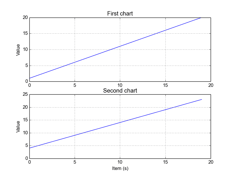 Python subplots
The plt.subplot() statement is key here. The subplot() command specifies numrows, numcols and fignum.
Styling the plot If you want thick lines or set the color, use:
plot(t, s, color="red", linewidth=2.5, linestyle="-")