
Matplotlib Pie chart
Matplotlib supports pie charts using the pie() function. You might like the Matplotlib gallery.
Matplotlib pie chart The code below creates a pie chart:
import matplotlib.pyplot as plt
# Data to plot
labels = 'Python', 'C++', 'Ruby', 'Java'
sizes = [215, 130, 245, 210]
colors = ['gold', 'yellowgreen', 'lightcoral', 'lightskyblue']
explode = (0.1, 0, 0, 0)  # explode 1st slice
# Plot
plt.pie(sizes, explode=explode, labels=labels, colors=colors,
autopct='%1.1f%%', shadow=True, startangle=140)
plt.axis('equal')
plt.show()
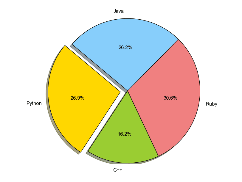 pie chart python
To add a legend use the plt.legend() function:
import matplotlib.pyplot as plt
labels = ['Cookies', 'Jellybean', 'Milkshake', 'Cheesecake']
sizes = [38.4, 40.6, 20.7, 10.3]
colors = ['yellowgreen', 'gold', 'lightskyblue', 'lightcoral']
patches, texts = plt.pie(sizes, colors=colors, shadow=True, startangle=90)
plt.legend(patches, labels, loc="best")
plt.axis('equal')
plt.tight_layout()
plt.show()
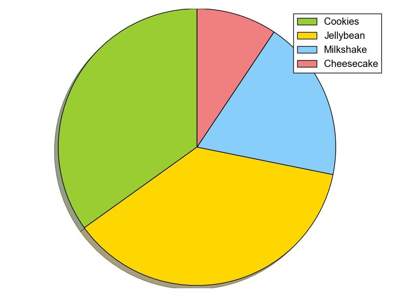 python pie chart
Create a donut chart
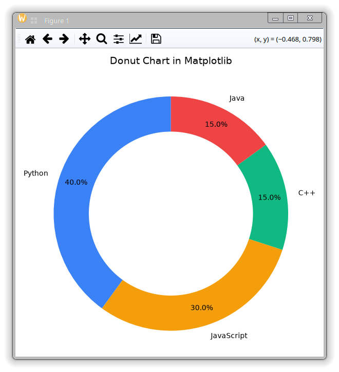
A donut chart is a pie chart with an empty center. You can make one by drawing a white circle in the middle using plt.Circle():
import matplotlib.pyplot as plt

# Data
labels = ['Python', 'JavaScript', 'C++', 'Java']
sizes = [40, 30, 15, 15]
colors = ['#3b82f6', '#f59e0b', '#10b981', '#ef4444']

fig, ax = plt.subplots()
ax.pie(sizes, labels=labels, colors=colors, autopct='%1.1f%%', startangle=90)

# Draw circle in the center
centre_circle = plt.Circle((0, 0), 0.70, fc='white')
fig.gca().add_artist(centre_circle)

plt.axis('equal')
plt.title('Donut chart in Matplotlib')
plt.tight_layout()
plt.show()
The parameter 0.70 sets the radius of the center circle.
Download All Matplotlib Examples