
Category: pro
Python hosting: Host, run, and code Python in the cloud!
tutorials
Support Vector Machine
A common task in Machine Learning is to classify data. Given a data point cloud, sometimes linear classification is impossible. In those cases we can use a Support Vector Machine instead, but an SVM can also work with linear separation.
Related Courses
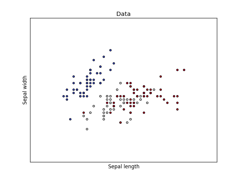
Dataset
We loading the Iris data, which we’ll later use to classify. This set has many features, but we’ll use only the first two features:
- sepal length
- sepal width
The code below will load the data points on the decision surface.
import matplotlib matplotlib.use('GTKAgg') import numpy as np import matplotlib.pyplot as plt from sklearn import svm, datasets # import some data to play with iris = datasets.load_iris() X = iris.data[:, :2] # we only take the first two features. y = iris.target h = .02 # step size in the mesh # create a mesh to plot in x_min, x_max = X[:, 0].min() - 1, X[:, 0].max() + 1 y_min, y_max = X[:, 1].min() - 1, X[:, 1].max() + 1 xx, yy = np.meshgrid(np.arange(x_min, x_max, h), np.arange(y_min, y_max, h)) # Plot also the training points plt.scatter(X[:, 0], X[:, 1], c=y, cmap=plt.cm.coolwarm) plt.xlabel('Sepal length') plt.ylabel('Sepal width') plt.xlim(xx.min(), xx.max()) plt.ylim(yy.min(), yy.max()) plt.xticks(()) plt.yticks(()) plt.title('Data') plt.show() |
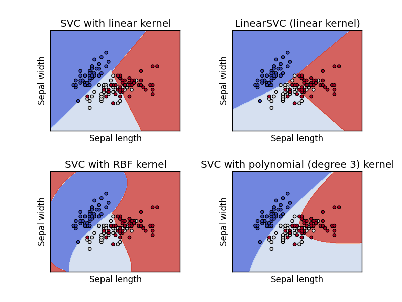
Support Vector Machine Example
Separating two point clouds is easy with a linear line, but what if they cannot be separated by a linear line?
In that case we can use a kernel, a kernel is a function that a domain-expert provides to a machine learning algorithm (a kernel is not limited to an svm).
The example below shows SVM decision surface using 4 different kernels, of which two are linear kernels.
import matplotlib matplotlib.use('GTKAgg') import numpy as np import matplotlib.pyplot as plt from sklearn import svm, datasets # import some data to play with iris = datasets.load_iris() X = iris.data[:, :2] # we only take the first two features. We could # avoid this ugly slicing by using a two-dim dataset y = iris.target h = .02 # step size in the mesh # we create an instance of SVM and fit out data. We do not scale our # data since we want to plot the support vectors C = 1.0 # SVM regularization parameter svc = svm.SVC(kernel='linear', C=C).fit(X, y) rbf_svc = svm.SVC(kernel='rbf', gamma=0.7, C=C).fit(X, y) poly_svc = svm.SVC(kernel='poly', degree=3, C=C).fit(X, y) lin_svc = svm.LinearSVC(C=C).fit(X, y) # create a mesh to plot in x_min, x_max = X[:, 0].min() - 1, X[:, 0].max() + 1 y_min, y_max = X[:, 1].min() - 1, X[:, 1].max() + 1 xx, yy = np.meshgrid(np.arange(x_min, x_max, h), np.arange(y_min, y_max, h)) # title for the plots titles = ['SVC with linear kernel', 'LinearSVC (linear kernel)', 'SVC with RBF kernel', 'SVC with polynomial (degree 3) kernel'] for i, clf in enumerate((svc, lin_svc, rbf_svc, poly_svc)): # Plot the decision boundary. For that, we will assign a color to each # point in the mesh [x_min, x_max]x[y_min, y_max]. plt.subplot(2, 2, i + 1) plt.subplots_adjust(wspace=0.4, hspace=0.4) Z = clf.predict(np.c_[xx.ravel(), yy.ravel()]) # Put the result into a color plot Z = Z.reshape(xx.shape) plt.contourf(xx, yy, Z, cmap=plt.cm.coolwarm, alpha=0.8) # Plot also the training points plt.scatter(X[:, 0], X[:, 1], c=y, cmap=plt.cm.coolwarm) plt.xlabel('Sepal length') plt.ylabel('Sepal width') plt.xlim(xx.min(), xx.max()) plt.ylim(yy.min(), yy.max()) plt.xticks(()) plt.yticks(()) plt.title(titles[i]) plt.show() |
Mathematische Operationen
Sie können den Python-Interpreter als Taschenrechner verwenden. Dazu starten Sie einfach Python ohne IDE und Dateinamen. Beispiel:
  Python 2.7.6 (Standard, 22. Juni 2015, 17:58:13)
[GCC 4.8.2] auf linux2
Geben Sie "help", "copyright", "Credits" oder "Lizenz" für weitere Informationen.
>>> 18 * 17
306
>>> 2 ** 4
16
>>>
Mathematische Funktionen
Python unterstützt eine Vielzahl von mathematischen Funktionen.
| Funktion | Gibt | Beispiel | |
|---|---|---|---|
| Abs(x) | Der Absolute Wert von x zurückgibt. |
|
|
| CMP(x,y) |
Gibt-1 zurück, wenn X < y Gibt 0 zurück, wenn x gleich y Gibt 1 zurück, wenn X > y. |
|
|
| EXP(x) | Kehrt die exponentielle x |
|
|
| Log(x) | Den natürlichen Logarithmus von x |
|
|
| log10(x) | Der Logarithmus Base-10 x |
|
|
| Pow(x,y) | Das Ergebnis von X ** y |
|
|
| sqrt(x) | Die Quadratwurzel von x |
|
Matplotlib Histogram
Matplotlib can be used to create histograms. A histogram shows the frequency on the vertical axis and the horizontal axis is another dimension. Usually it has bins, where every bin has a minimum and maximum value. Each bin also has a frequency between x and infinite.
Related course
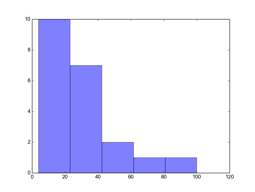
Matplotlib histogram example
Below we show the most minimal Matplotlib histogram:
import numpy as np import matplotlib.mlab as mlab import matplotlib.pyplot as plt x = [21,22,23,4,5,6,77,8,9,10,31,32,33,34,35,36,37,18,49,50,100] num_bins = 5 n, bins, patches = plt.hist(x, num_bins, facecolor='blue', alpha=0.5) plt.show() |
Output:
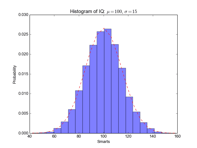
A complete matplotlib python histogram
Many things can be added to a histogram such as a fit line, labels and so on. The code below creates a more advanced histogram.
#!/usr/bin/env python import numpy as np import matplotlib.mlab as mlab import matplotlib.pyplot as plt # example data mu = 100 # mean of distribution sigma = 15 # standard deviation of distribution x = mu + sigma * np.random.randn(10000) num_bins = 20 # the histogram of the data n, bins, patches = plt.hist(x, num_bins, normed=1, facecolor='blue', alpha=0.5) # add a 'best fit' line y = mlab.normpdf(bins, mu, sigma) plt.plot(bins, y, 'r--') plt.xlabel('Smarts') plt.ylabel('Probability') plt.title(r'Histogram of IQ: $\mu=100$, $\sigma=15$') # Tweak spacing to prevent clipping of ylabel plt.subplots_adjust(left=0.15) plt.show() |
Output:
Matplotlib Bar chart
Matplotlib may be used to create bar charts. You might like the Matplotlib gallery.
Related course
The course below is all about data visualization:
Bar chart code
The code below creates a bar chart:
import matplotlib.pyplot as plt; plt.rcdefaults() import numpy as np import matplotlib.pyplot as plt objects = ('Python', 'C++', 'Java', 'Perl', 'Scala', 'Lisp') y_pos = np.arange(len(objects)) performance = [10,8,6,4,2,1] plt.bar(y_pos, performance, align='center', alpha=0.5) plt.xticks(y_pos, objects) plt.ylabel('Usage') plt.title('Programming language usage') plt.show() |
Output:

Matplotlib charts can be horizontal, to create a horizontal bar chart:
import matplotlib.pyplot as plt; plt.rcdefaults() import numpy as np import matplotlib.pyplot as plt objects = ('Python', 'C++', 'Java', 'Perl', 'Scala', 'Lisp') y_pos = np.arange(len(objects)) performance = [10,8,6,4,2,1] plt.barh(y_pos, performance, align='center', alpha=0.5) plt.yticks(y_pos, objects) plt.xlabel('Usage') plt.title('Programming language usage') plt.show() |
Output:

More on bar charts
You can compare two data series using this Matplotlib code:
import numpy as np import matplotlib.pyplot as plt # data to plot n_groups = 4 means_frank = (90, 55, 40, 65) means_guido = (85, 62, 54, 20) # create plot fig, ax = plt.subplots() index = np.arange(n_groups) bar_width = 0.35 opacity = 0.8 rects1 = plt.bar(index, means_frank, bar_width, alpha=opacity, color='b', label='Frank') rects2 = plt.bar(index + bar_width, means_guido, bar_width, alpha=opacity, color='g', label='Guido') plt.xlabel('Person') plt.ylabel('Scores') plt.title('Scores by person') plt.xticks(index + bar_width, ('A', 'B', 'C', 'D')) plt.legend() plt.tight_layout() plt.show() |
Output:

Download All Matplotlib Examples
Matplotlib Pie chart
Matplotlib supports pie charts using the pie() function. You might like the Matplotlib gallery.
Related course:
Matplotlib pie chart
The code below creates a pie chart:
import matplotlib.pyplot as plt # Data to plot labels = 'Python', 'C++', 'Ruby', 'Java' sizes = [215, 130, 245, 210] colors = ['gold', 'yellowgreen', 'lightcoral', 'lightskyblue'] explode = (0.1, 0, 0, 0) # explode 1st slice # Plot plt.pie(sizes, explode=explode, labels=labels, colors=colors, autopct='%1.1f%%', shadow=True, startangle=140) plt.axis('equal') plt.show() |
Output:

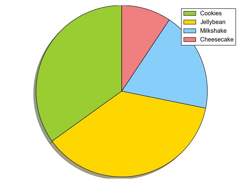
To add a legend use the plt.legend() function:
import matplotlib.pyplot as plt labels = ['Cookies', 'Jellybean', 'Milkshake', 'Cheesecake'] sizes = [38.4, 40.6, 20.7, 10.3] colors = ['yellowgreen', 'gold', 'lightskyblue', 'lightcoral'] patches, texts = plt.pie(sizes, colors=colors, shadow=True, startangle=90) plt.legend(patches, labels, loc="best") plt.axis('equal') plt.tight_layout() plt.show() |
Output:
Download All Matplotlib Examples
Netflix like Thumbnails with Python
Inspired by Netflix, we decided to implement a focal point algorithm. If you use the generated thumbnails on mobile websites, it may increase your click-through-rate (CTR) for YouTube videos.
Eiterway, it’s a fun experiment.
Focal Point
All images have a region of interest, usually a person or face.
This algorithm that finds the region of interest is called a focal point algorithm. Given an input image, a new image (thumbnail) will be created based on the region of interest.

Start with an snapshot image that you want to use as a thumbnail. We use Haar features to find the most interesting region in an image. The haar cascade files can be found here:
- https://raw.githubusercontent.com/Itseez/opencv/master/data/lbpcascades/lbpcascade_frontalface.xml
- https://github.com/adamhrv/HaarcascadeVisualizer
Download these files in a /data/ directory.
#! /usr/bin/python import cv2 bodyCascade = cv2.CascadeClassifier('data/haarcascade_mcs_upperbody.xml') frame = cv2.imread('snapshot.png') frameHeight, frameWidth, frameChannels = frame.shape regions = bodyCascade.detectMultiScale(frame, 1.8, 2) x,y,w,h = regions[0] cv2.imwrite('thumbnail.png', frame[0:frameHeight,x:x+w]) cv2.rectangle(frame,(x,0),(x+w,frameHeight),(0,255,255),6) cv2.imshow("Result",frame) cv2.waitKey(0); |
We load the haar cascade file using cv2.CascadeClassifier() and we load the image using cv2.imread()
Then bodyCascade.detectMultiScale() detects regions of interest using the loaded haar features.
The image is saved as thumbnail using cv2.imwrite() and finally we show the image and highlight the region of interest with a rectangle. After running you will have a nice thumbnail for mobile webpages or apps.
If you also want to detect both body and face you can use:
#! /usr/bin/python import cv2 bodyCascade = cv2.CascadeClassifier('data/haarcascade_mcs_upperbody.xml') faceCascade = cv2.CascadeClassifier('data/lbpcascade_frontalface.xml') frame = cv2.imread('snapshot2.png') frameHeight, frameWidth, frameChannels = frame.shape regions = bodyCascade.detectMultiScale(frame, 1.5, 2) x,y,w,h = regions[0] cv2.imwrite('thumbnail.png', frame[0:frameHeight,x:x+w]) cv2.rectangle(frame,(x,0),(x+w,frameHeight),(0,255,255),6) faceregions = faceCascade.detectMultiScale(frame, 1.5, 2) x,y,w,h = faceregions[0] cv2.rectangle(frame,(x,y),(x+w,y+h),(0,255,0),6) cv2.imshow("Result",frame) cv2.waitKey(0); cv2.imwrite('out.png', frame) |