Category: pro
Python hosting: Host, run, and code Python in the cloud!
3d scatterplot
Matplotlib can create 3d plots. Making a 3D scatterplot is very similar to creating a 2d, only some minor differences. On some occasions, a 3d scatter plot may be a better data visualization than a 2d plot. To create 3d plots, we need to import axes3d.
Related course:
Data Visualization with Python and Matplotlib
Introduction
It is required to import axes3d:
from mpl_toolkits.mplot3d import axes3d |
Give the data a z-axis and set the figure to 3d projection:
ax = fig.gca(projection='3d') |

3d scatterplot
Complete 3d scatterplot example below:
import numpy as np import matplotlib.pyplot as plt from mpl_toolkits.mplot3d import axes3d # Create data N = 60 g1 = (0.6 + 0.6 * np.random.rand(N), np.random.rand(N),0.4+0.1*np.random.rand(N)) g2 = (0.4+0.3 * np.random.rand(N), 0.5*np.random.rand(N),0.1*np.random.rand(N)) g3 = (0.3*np.random.rand(N),0.3*np.random.rand(N),0.3*np.random.rand(N)) data = (g1, g2, g3) colors = ("red", "green", "blue") groups = ("coffee", "tea", "water") # Create plot fig = plt.figure() ax = fig.add_subplot(1, 1, 1, axisbg="1.0") ax = fig.gca(projection='3d') for data, color, group in zip(data, colors, groups): x, y, z = data ax.scatter(x, y, z, alpha=0.8, c=color, edgecolors='none', s=30, label=group) plt.title('Matplot 3d scatter plot') plt.legend(loc=2) plt.show() |
The plot is created using several steps:
- vector creation (g1,g2,g3)
- list creation (groups)
- plotting
The final plot is shown with plt.show()
Matplotlib Subplot
The Matplotlib subplot() function can be called to plot two or more plots in one figure. Matplotlib supports all kind of subplots including 2×1 vertical, 2×1 horizontal or a 2×2 grid.
Related courses
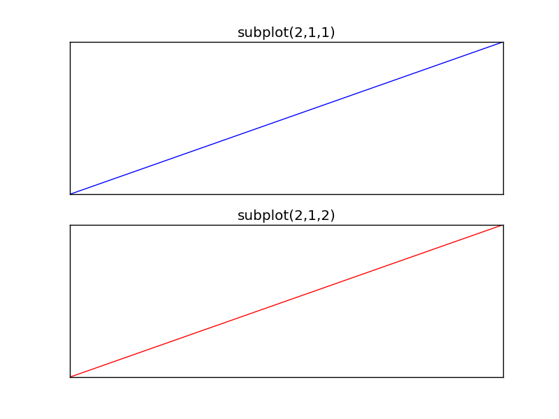
Horizontal subplot
Use the code below to create a horizontal subplot
from pylab import * t = arange(0.0, 20.0, 1) s = [1,2,3,4,5,6,7,8,9,10,11,12,13,14,15,16,17,18,19,20] subplot(2,1,1) xticks([]), yticks([]) title('subplot(2,1,1)') plot(t,s) subplot(2,1,2) xticks([]), yticks([]) title('subplot(2,1,2)') plot(t,s,'r-') show() |
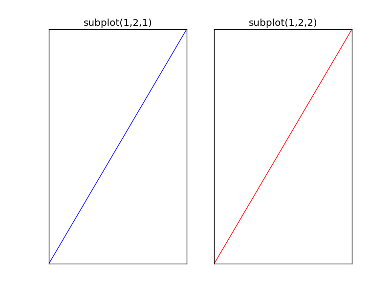
Vertical subplot
By changing the subplot parameters we can create a vertical plot
from pylab import * t = arange(0.0, 20.0, 1) s = [1,2,3,4,5,6,7,8,9,10,11,12,13,14,15,16,17,18,19,20] subplot(1,2,1) xticks([]), yticks([]) title('subplot(1,2,1)') plot(t,s) subplot(1,2,2) xticks([]), yticks([]) title('subplot(1,2,2)') plot(t,s,'r-') show() |
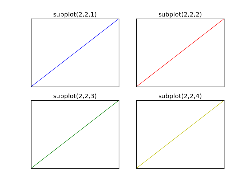
Subplot grid
To create a 2×2 grid of plots, you can use this code:
from pylab import * t = arange(0.0, 20.0, 1) s = [1,2,3,4,5,6,7,8,9,10,11,12,13,14,15,16,17,18,19,20] subplot(2,2,1) xticks([]), yticks([]) title('subplot(2,2,1)') plot(t,s) subplot(2,2,2) xticks([]), yticks([]) title('subplot(2,2,2)') plot(t,s,'r-') subplot(2,2,3) xticks([]), yticks([]) title('subplot(2,2,3)') plot(t,s,'g-') subplot(2,2,4) xticks([]), yticks([]) title('subplot(2,2,4)') plot(t,s,'y-') show() |
Matplot Matrix Correlation
A correlation diagram can be created using Matplotlib. Matplotlib is the most used plotting library for Python. It can be included in all the graphical toolkits that are available for Python.
Related courses
Matrix definition
To start we define a 2×2 matrix and a list called groups. The matrix is defined inside the brackets (double [[ and ]] if written on a single line).
m = [ [1,0,2,0,0], [1,1,1,2,0], [0,4,1,0,0], [0,4,4,1,2], [1,3,0,0,1], ] groups = ['Blues','Jazz','Rock','House','Dance'] |
Visual:
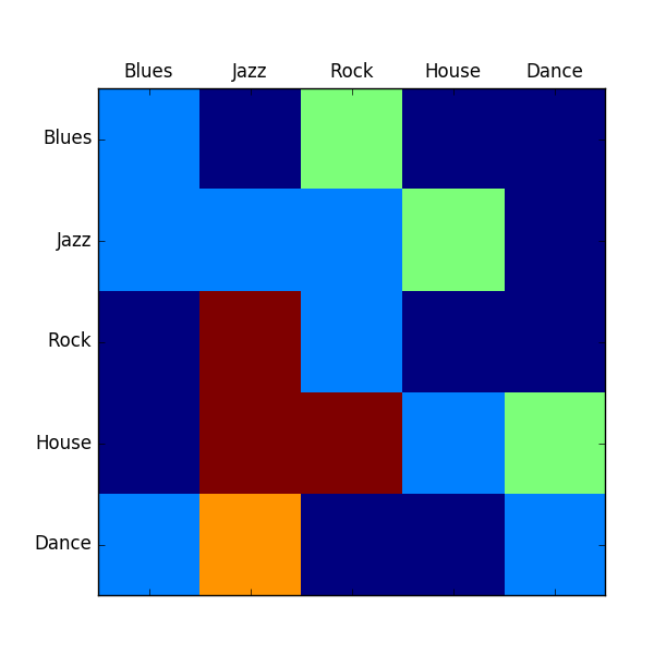
Matrix correlation
The code below generates a Matrix correlation diagram using Matplotlib.
import matplotlib.pyplot as plt import numpy as np m = [ [1,0,2,0,0], [1,1,1,2,0], [0,4,1,0,0], [0,4,4,1,2], [1,3,0,0,1], ] plt.matshow(m) groups = ['Blues','Jazz','Rock','House','Dance'] x_pos = np.arange(len(groups)) plt.xticks(x_pos,groups) y_pos = np.arange(len(groups)) plt.yticks(y_pos,groups) plt.show() |
Initially we define the matrix (m) and the list (groups).
We set the length to be equal to the length of the groups. On the x axis and y axis we set the group names.
Image histogram
A histogram is collected counts of data organized into a set of bins. Every bin shows the frequency. OpenCV can generate histograms for both color and gray scale images. You may want to use histograms for computer vision tasks.
Related course
Histogram example
Given an image we can generate a histogram for the blue, green and red values.
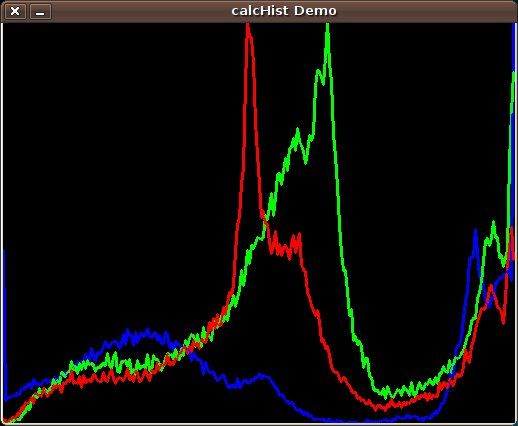
We use the function cv.CalcHist(image, channel, mask, histSize, range)
Parameters:
- image: should be in brackets, the source image of type uint8 or float32
- channel: the color channel to select. for grayscale use [0]. color image has blue, green and red channels
- mask: None if you want a histogram of the full image, otherwise a region.
- histSize: the number of bins
- range: color range:
Histogram for a color image:
# draw histogram in python. import cv2 import numpy as np img = cv2.imread('image.jpg') h = np.zeros((300,256,3)) bins = np.arange(256).reshape(256,1) color = [ (255,0,0),(0,255,0),(0,0,255) ] for ch, col in enumerate(color): hist_item = cv2.calcHist([img],[ch],None,[256],[0,255]) cv2.normalize(hist_item,hist_item,0,255,cv2.NORM_MINMAX) hist=np.int32(np.around(hist_item)) pts = np.column_stack((bins,hist)) cv2.polylines(h,[pts],False,col) h=np.flipud(h) cv2.imshow('colorhist',h) cv2.waitKey(0) |
Flask and great looking charts using Chart.js
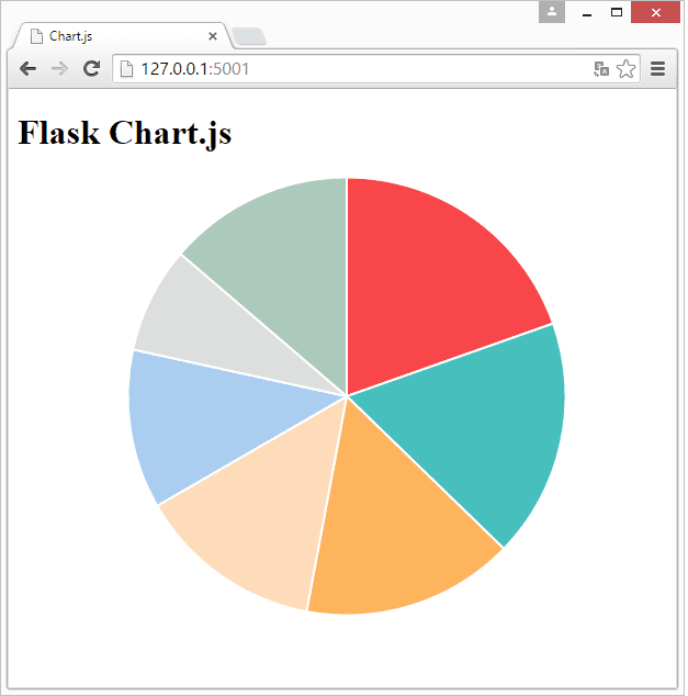
Chart.js is a javascript library to create simple and clean charts. All of them are HTML5 based, responsive, modular, interactive and there are in total 6 charts.
Related course
Python Flask: Make Web Apps with Python
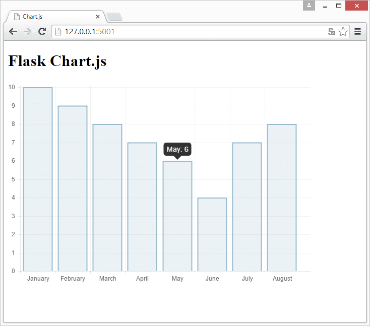
We will start by creating a web application that displays a bar chart from a Python array. Create a directory /templates/ and add the file chart.html with this content:
<meta charset="utf-8"/> <title>Chart.js </title> <!-- import plugin script --> <script src="static/Chart.min.js"></script> <h1>Flask Chart.js</h1> <!-- bar chart canvas element --><canvas id="chart" width="600" height="400"></canvas> <script><br /> // bar chart data<br /> var barData = {<br /> labels : [{% for item in labels %}<br /> "{{item}}",<br /> {% endfor %}],<br /> datasets : [<br /> {<br /> fillColor: "rgba(151,187,205,0.2)",<br /> strokeColor: "rgba(151,187,205,1)",<br /> pointColor: "rgba(151,187,205,1)",<br /> data : [{% for item in values %}<br /> {{item}},<br /> {% endfor %}]<br /> }<br /> ]<br /> } <p> // get bar chart canvas<br /> var mychart = document.getElementById("chart").getContext("2d");</p> <p> steps = 10<br /> max = 10<br /> // draw bar chart<br /> new Chart(mychart).Bar(barData, {<br /> scaleOverride: true,<br /> scaleSteps: steps,<br /> scaleStepWidth: Math.ceil(max / steps),<br /> scaleStartValue: 0,<br /> scaleShowVerticalLines: true,<br /> scaleShowGridLines : true,<br /> barShowStroke : true,<br /> scaleShowLabels: true<br /> });</p> <p></p></script> |
Create the directory /static/ and add the file Chart.min.js to it. You can get it either from the Chart.js website or use the link. Finally go into the home directory and create app.py with this contents:
from flask import Flask from flask import Markup from flask import Flask from flask import render_template app = Flask(__name__) @app.route("/") def chart(): labels = ["January","February","March","April","May","June","July","August"] values = [10,9,8,7,6,4,7,8] return render_template('chart.html', values=values, labels=labels) if __name__ == "__main__": app.run(host='0.0.0.0', port=5001) |
Finally run:
python app.py |
Continue reading “Flask and great looking charts using Chart.js”